Reflex
Reflex is Utrecht’s leading self-defense center, specializing in boxing and functional fitness. Through small-group classes and personal coaching, members build strength, confidence, and resilience with focused, hands-on training.
Client
Reflex
Expertises
UX-UI design / Branding
Duration
12 weeks

Problem
The website no longer reflected Reflex’s new positioning as a boxing and functional fitness center after the change in ownership.
The brand focus was unclear, while the website structure and navigation made it difficult for visitors to find classes, understand memberships, and discover the right training options.
Solution
The redesign introduced a clearer structure and intuitive navigation, allowing visitors to quickly find classes, understand memberships, and explore training options.
By simplifying the user journey and strengthening the brand focus, Reflex’s new positioning became immediately clear, resulting in increased trial class sign-ups and new memberships.

Making classes easy to explore
With a wide range of training options and an extensive menu, Reflex needed a clearer way to guide visitors through its classes. The navigation was restructured by prioritizing the most important pages and classes, making key information easier to find.
Classes were grouped logically and presented in a scannable way, helping visitors quickly understand the differences between classes.


Designing for growth and conversion
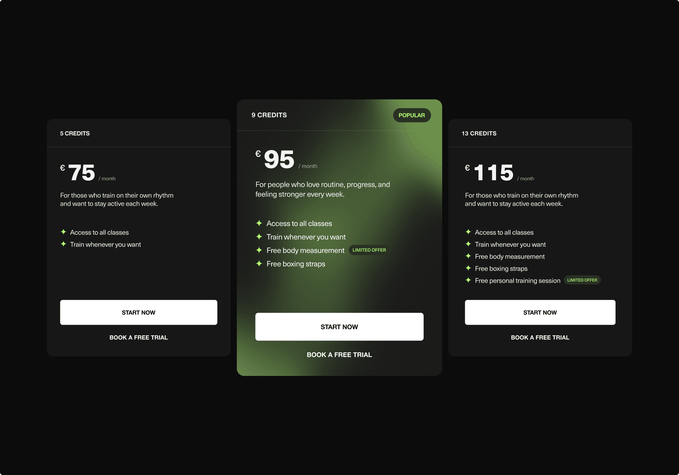
The membership offering was optimized by reducing 15 overlapping memberships to 3 clear options. Rather than presenting small variations, memberships were consolidated and restructured around different lifestyles and training habits, making it easier for visitors to identify the option that best fits their needs. This simplified experience increases clarity, builds confidence, and supports conversion.


Credits
Branding
Jake Posthouwer
UX / UI Design
Kaylin Bartelings
Jake Posthouwer
